 SUNCLAX

I tried 7 planners on my Kindle Scribe. All seven died by April. So I built one.
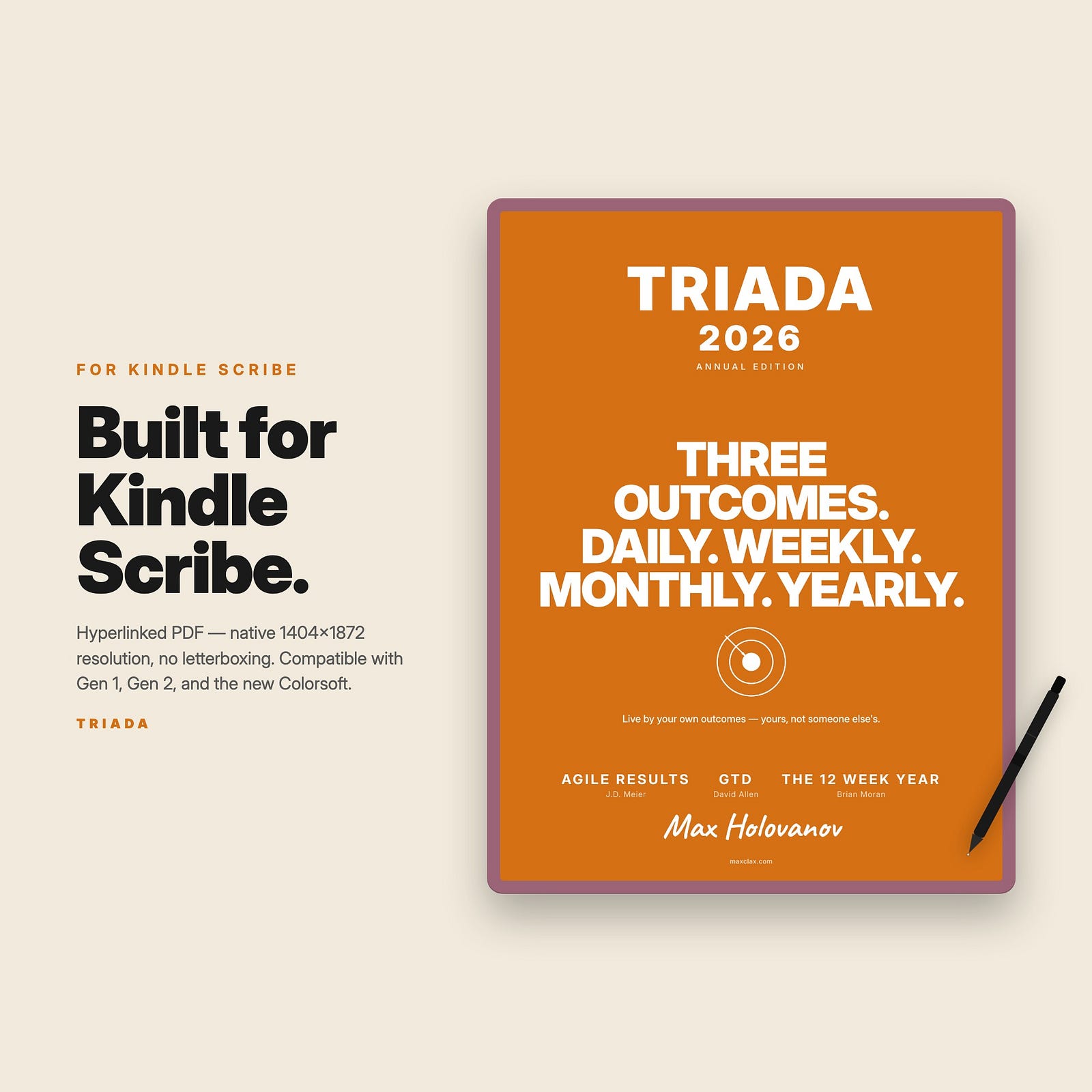
Six months of design decisions. Outcomes vs tasks, hyperlinks on every page, and why streaks are the reason your planner is in a drawer right now.
Wednesday in April. Kindle Scribe open. Someone’s beautiful annual planner staring back at me — 12 empty checkboxes, a habit tracker with red Xs across the days I skipped, a “weekly intentions” box still showing intentions I set six weeks ago and quietly stopped pretending I’d hit.
I close the file. Push another planner to the Scribe. Try again. By April, I’d done this with seven planners.
Then I stopped trying. I opened Emacs and started building my own.
Why every Scribe planner I tried died by April
Three failure modes. In order of how often they killed the thing.
1. Streak shame. Every planner had some version of a habit tracker — little circles you fill in to “build the streak.” The pitch is motivational. The reality, by week three: one skipped day. Then another. Now the visual record of your failure is staring back from every page. The shame isn’t motivating. It’s the reason you stop opening the file.
2. Tasks instead of outcomes. ”Write the report. Call mom. Hit the gym.” That’s a to-do list. It tells you what to do, not what you finished. A week of these and the only feedback loop is “did I do all the things?” — which is almost never yes. Three months in, you can’t tell whether your year is moving or just busy. The artifact you’re keeping is a record of motion, not direction.
3. Navigation hell. A 500-page PDF on a Kindle Scribe with no internal links is a horror to use. May 14 to May 23? Page turn, page turn, page turn. Compare last month’s reflection to this month’s? Hope you remember the page number. Beautiful typography doesn’t matter when you’re scrolling 30 pages to find Tuesday.
I needed a planner that didn’t shame me, that recorded direction instead of motion, and that respected the tap-to-navigate nature of the Scribe. None of the seven I tried did all three. Most did none.
Three ideas I built on
Before building, I went back to three books that had shaped how I think about my work.
Agile Results — J.D. Meier. The single best idea in that book is the Rule of Three. Three outcomes for today. Three for the week. Three for the month. Three for the year. Not four. Not “as many as I can manage.” Three. The discipline of three is what forces real prioritization — anything more and you’re back to writing wish lists.
The 12 Week Year — Brian Moran. Most people set yearly goals in January and forget them by May because twelve months is too long for the brain to feel urgency about. Moran’s fix: treat each quarter as your year. Your “year” is the next twelve weeks. Four sprints, each one close enough to push for.
GTD (Getting Things Done) — David Allen. I cherry-picked two things from it: the Inbox — capture anything that pulls at your attention, sort later — and the weekly review — every Friday, look back at what worked and what didn’t. The rest of GTD is heavy machinery. These two ideas are the parts that compound.
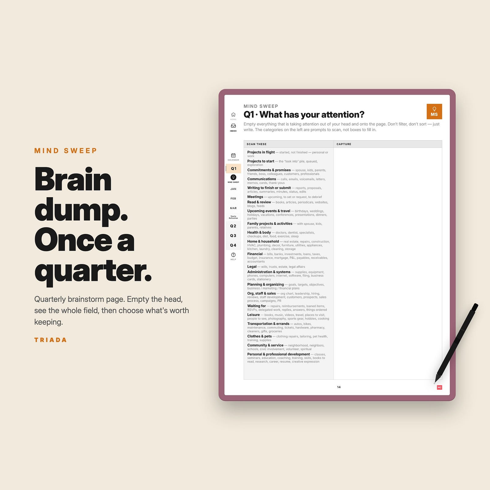
I wanted to ship the planner that fell out of those three books — without making the buyer read any of them.
The build: six months of small decisions
Outcomes, not tasks. Always past tense.
First design rule: the planner doesn’t ask what you’re going to do. It asks what you’ll have finished.
The daily page asks for three daily outcomes in past tense: ”I shipped the report — and now I can take the weekend without my laptop.” Not “ship the report.” The shift sounds small. The effect is large: writing a past-tense outcome forces you to imagine the day already done and ask whether shipping the report actually unlocks anything. If it doesn’t, it isn’t your outcome — it’s someone else’s task you accepted by accident.
Same rule at weekly, monthly, and quarterly scopes. Three outcomes. Past tense. Each one ends in ”and now I can…”
Receipts, not intentions.
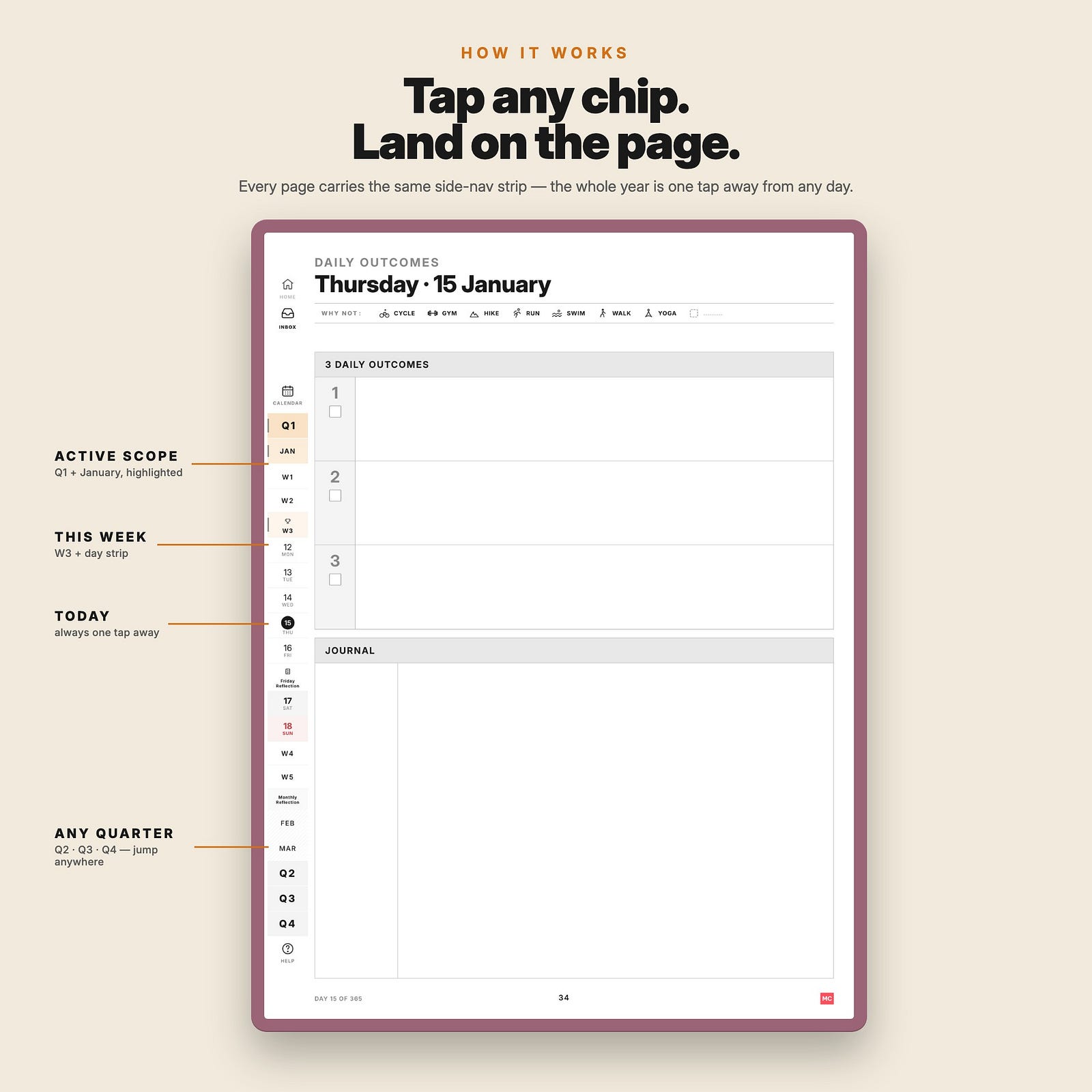
Sidebar on every page. The whole year is one tap away.
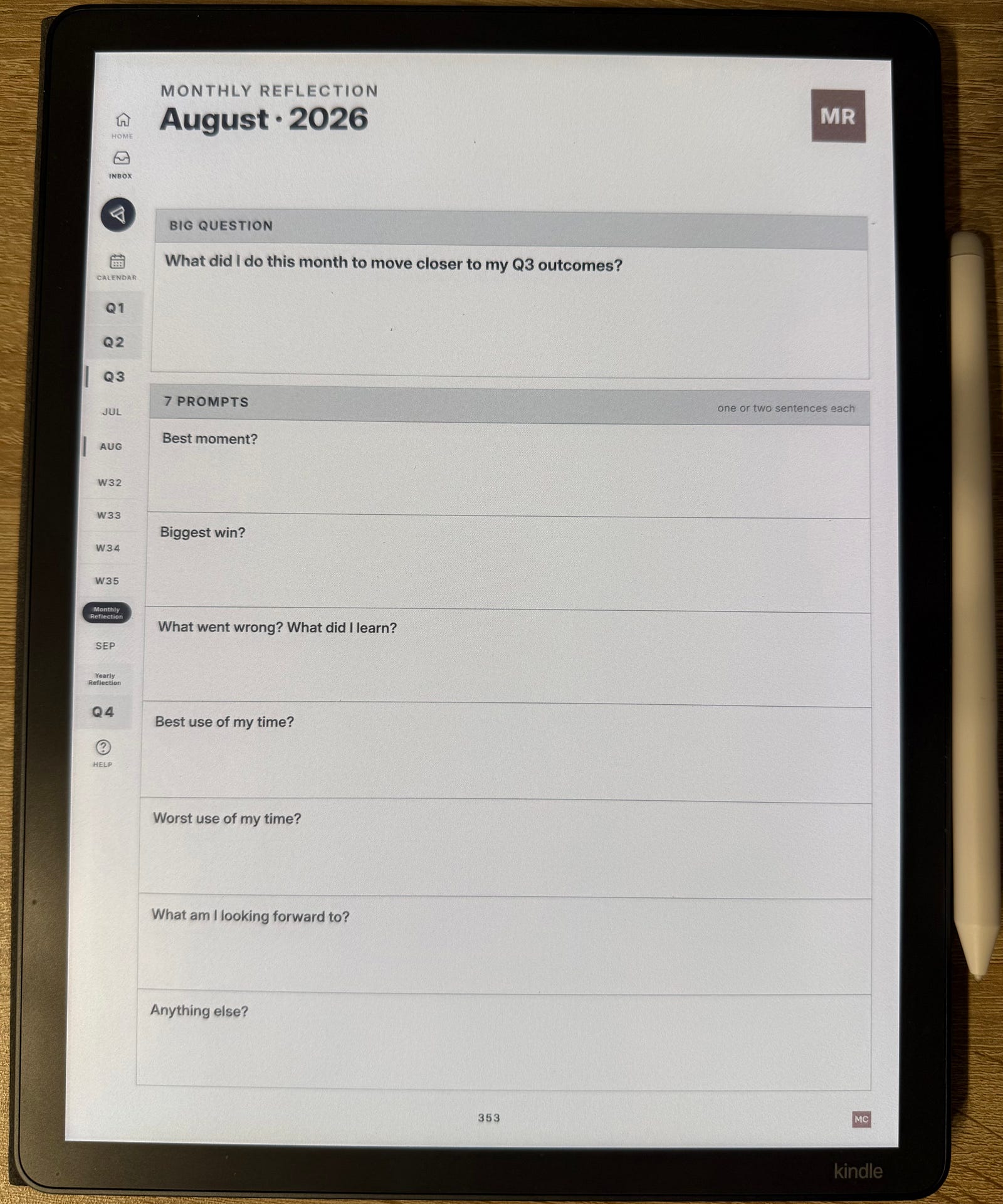
The navigation problem was the easiest to fix and the hardest to design. Every page in TRIADA carries the same sidebar strip down the left edge:
- Inbox at the top
- Home + Calendar
- Q1 · Q2 · Q3 · Q4
- The active month’s day strip (Mon · Tue · Wed · Thu · Fri/FR · Sat · Sun)
- Mind Sweep for the active quarter
- Monthly Reflection chip
- Help at the bottom
Every chip is a hyperlink. On June 14, want Q3’s yearly outcomes? Tap Q3. On a daily page, want to add something to your Inbox? Tap Inbox. The whole 530-page document collapses into one tap of distance.
The constraint that forced this: e-ink page turns are slow. If the planner needs more than one tap to get anywhere, the buyer abandons the navigation and starts page-flipping. So one tap had to cover everything.
Friday Reflection lives behind Friday’s daily.
Most planners with a weekly review put it in a separate notebook, or at the end of the year, or in a “reflection journal” you’re supposed to keep alongside the planner. By week three, the reflection notebook is in a drawer.
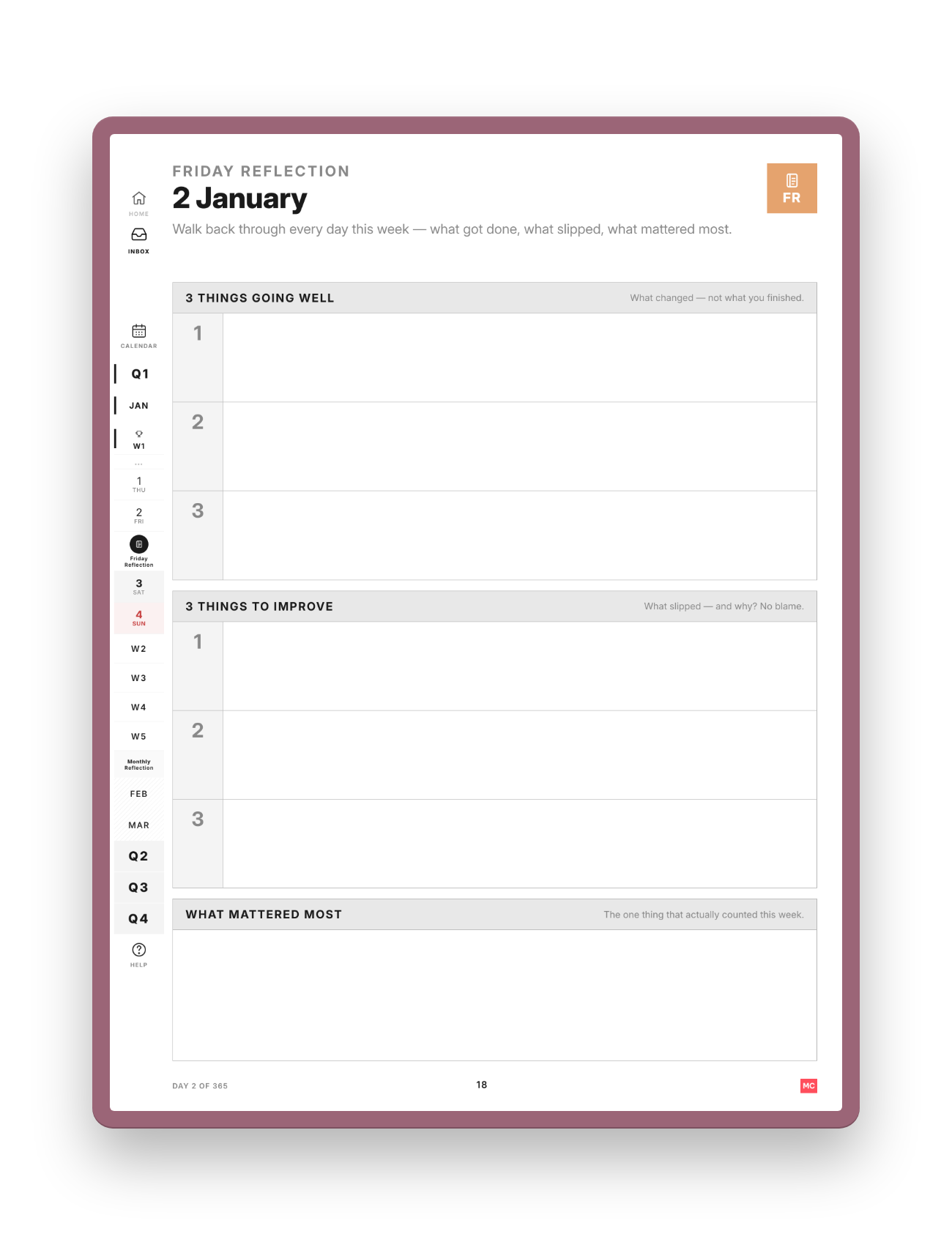
TRIADA’s Friday Reflection is five pages back from any weekday’s daily. Same hyperlink rhythm — open the planner, tap FR. Five minutes. Three questions:
- 3 things that went well — what changed, not what you finished
- 3 things to improve — what slipped, and why? No blame
- The one thing that mattered most — the single thing that actually counted this week
That last one is deliberately one line, not three. The whole force of the question is that it makes you pick one.
And that’s where the page stops. There’s no “plan next week” box — on purpose. Friday Reflection looks back; it doesn’t plan. Next week’s three outcomes get set fresh on Monday’s Weekly Outcomes page. A new week is a new life.
No streak counter. No shame. Skipped Monday means skipped Monday.
The biggest behavioral change in TRIADA vs every planner I’d tried: there’s no record of what you skipped. No red Xs. No “current streak: 0” counter. No “you missed last week’s reflection” reminder.
Why: the system survives gaps. Perfectionism is what breaks it. A planner that punishes you for missing a day is a planner that punishes you for being human.
Open the page. Write three. Continue. That’s the whole thing.
One PDF. Five languages. Every device.
It’s a PDF. Not an app. Not a sync service. Not a Notion template. You download it, send it to your device, write on it with the pen. No account. No login. No subscription.
Five languages, translated — English, Українська, Deutsch, Español. There’s also a Russian (Русский) version. It comes with one condition: it’s published for readers who already know why the right way to open a conversation is «Слава Україні». If those words sit well with you, you’re welcome here. If they don’t — the other four versions are the ones meant for you.
Adapted variants for Kindle Scribe, reMarkable, iPad, Boox, and Supernote — same design, fitted to each screen. Yours forever.
What I’d build the same way again
Mid-year is fine to start. Your year is the next 12 weeks. The first quarter of TRIADA starts whenever you open the file — not on January 1. The “I’ll start fresh next year” instinct is what kills the system before it begins.
Three is the right number. Tested two and four. Two felt thin. Four blurred priority. Three is enough to feel like a real week of work, few enough to remember without re-reading.
The Friday Reflection compounds. The yearly review doesn’t. Twelve months of Fridays is fifty-two course corrections. Twelve months of “year-end reviews” is one. The shorter loop wins, every time.
Sidebar-on-every-page was 80% of the buyer reaction. Of the early-feedback notes I got from people who tried the sample, the single most common line was some version of ”I tapped Q3 and it just worked.” The navigation isn’t a feature. It’s the thing that makes any of the other ideas usable.
If you want to see it
The free sample is the actual first ~62 pages: front matter, all of January, January Reflection, February’s Monthly Outcomes. Not a teaser. Not watermarked. You can use January from the sample as your real January.
- Free sample (Monday-start): triada-sample.pdf
- Free sample (Sunday-start, US/Canada): triada-sample-sunday.pdf
- See the full edition + device variants: https://maxclax.com/triada
If you’ve built or used a Scribe planner that solved any of the three problems above differently — I’d love to hear about it. Drop a comment. Or, if you’re shipping outcomes instead of pretending, tell me which ones.